Websites for clinical research sites, CROs and biopharma
A patient deciding whether to raise their hand. A sponsor running a desk review before your name reaches a short list. Most research site websites serve one of them well and leave the other to chance. We build for both.
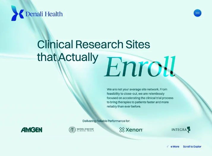
Seven websites built for research sites, CROs and diagnostics companies. Selected work: C7 Research · Denali Health · Apex Dx.
The problem
Two readers who never meet
A research site's website is read by two people with nothing in common. One is a patient, probably on a phone, trying to work out whether a study is for them and what happens if they get in touch. The other is a sponsor or CRO feasibility lead, quietly checking whether the site behind the website looks credible and well run. Neither of them will tell you what they were looking for. They just leave.
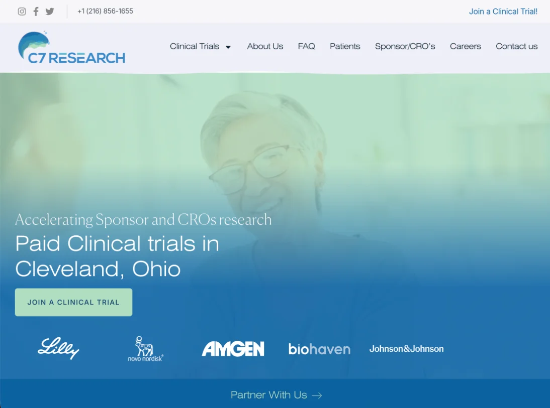
Same website, patient view
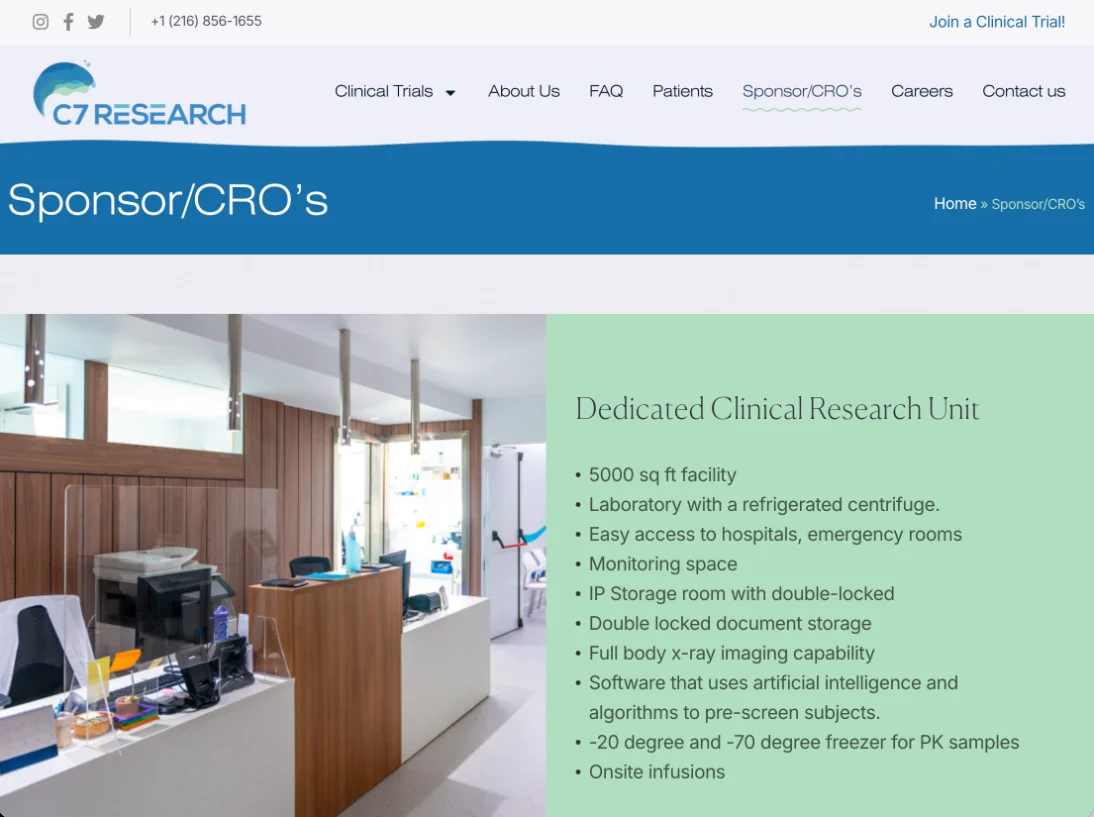
Same website, sponsor view
What the patient needs
- •The study described in their sentence, not the protocol title
- •A plain answer to "might I qualify"
- •What happens after they raise their hand
- •Compensation, visits and time commitment, stated honestly
- •A form short enough to finish on a phone
What the sponsor needs
- •Investigator credentials and therapeutic-area experience, findable in two clicks
- •Site capabilities: staff, equipment, patient population, past enrollment
- •Evidence of process: IRB relationships, start-up timelines, quality record
- •Clear routing for feasibility and partnership enquiries
- •A website that signals the site behind it is well run
Most websites are built for one of these people. The other one is where the money leaks.
Selected work
Built for the people who actually read them
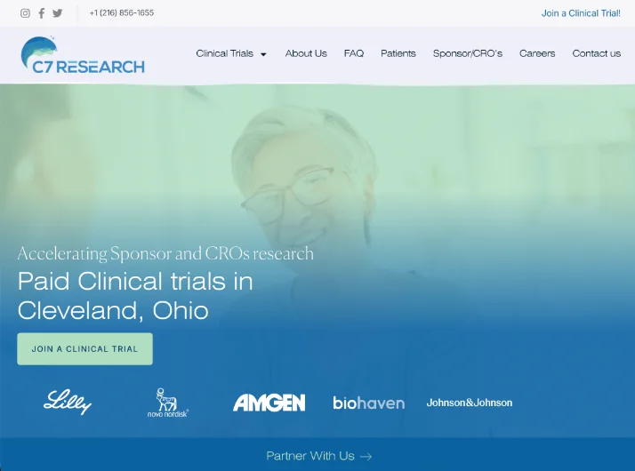

What's included
Everything a research site website needs, in one engagement
A typical project is a custom website delivered in eight weeks. These are included, not added on.
Study page architecture
Every active study gets its own page, written for the patient and structured for search. Closed studies stay live with an honest status instead of a 404.
Patient-facing content
Plain-language study descriptions, eligibility explained without over-promising, and risk language handled honestly even when it costs a conversion.
Sponsor-facing proof of capability
Investigator credentials, therapeutic-area experience, site capabilities and enrollment history, placed where a desk review will look for them.
Technical SEO for condition and city search
The queries that matter are "paid clinical trials near me" and "[condition] study [city]". We build the website to rank for them from day one.
Accessibility as a requirement
WCAG 2.2 AA as part of the build, not a final-week audit. Patients with the conditions you study are often the ones accessibility failures shut out.
Measurement and conversion
Form analytics, call tracking and a review after launch so you know which studies the website is actually feeding.
Branding and identity available when a site needs it. Ask.
Ways to work together
Benchmark Review
A scored review of your current website against all 70 items, with a prioritized fix list. Five working days, fixed fee.
How it worksResearch Site Website
A custom website built for patients and sponsor desk reviews, delivered in eight weeks.
What's includedWebsite Refresh
Keep what works, fix what the Benchmark says is missing. Three to four weeks.
See if it fitsWhy only clinical research
We work in one industry. That is the whole point.
We speak the language
IRB, feasibility, screening, enrollment, NCT IDs, WCAG. None of it is vocabulary we had to learn on your project. You will not spend the kickoff call explaining what a CRO does.
We design for both readers
General agencies build for one audience because that is how every other industry works. Research site websites are the exception, and the sponsor reading yours is the one you never hear from.
We stay small on purpose
A team of five, a handful of projects at a time, custom design on every one. It is what keeps the work custom and the timeline at eight weeks instead of eight months.
Standard, no sign-up
The 70-item standard we build against
We wrote it down. The Trialsfocus Benchmark is a 70-item standard across eight groups, from sponsor and CRO signals to accessibility and the things nearly every website overlooks. Use it to review your own website, or hand it to whoever builds your next one.
70 items · 8 groups · No email required
Process
Eight weeks, four stages, one point of contact
One person runs your project from first call to launch. It is usually the founder.
PositioningWeek 1
Who the website is for, what a sponsor needs to see, which studies and conditions matter for search. We interview you and, where possible, a coordinator.
Structure and messagingWeeks 2–3
Sitemap, study page templates and every headline written before any design starts. You approve words, not wireframes.
Design and buildWeeks 4–7
Custom design, then development on a stack your team can update without calling us. Accessibility and technical SEO are built in here, not bolted on.
Launch and measureWeek 8 and after
Launch, analytics, form and call tracking, and a review 30 days later to see which studies the website is feeding.
From clients
“I cannot be more thankful for the wonderful and intentional work that you set forth here. It has brought excitement to the entire team and our patients as well.”

About
Trialsfocus is a small team, and that is deliberate
I started Trialsfocus after building websites for research sites through a general web practice and noticing the same thing on every project: the brief was written for patients, and the sponsor was never mentioned. Once you have seen a feasibility questionnaire, you cannot unsee what a research site website is really for.
We are a team of five. We take a small number of projects at a time, I run every one of them personally, and we do not work outside clinical research. If that sounds like the kind of agency you would rather work with, the Benchmark is a good place to see how we think.
Ali Demirci · Founder, Trialsfocus
More about the team on LinkedInInsights
Notes on how research site websites actually get used
Want a second pair of eyes on your current website?
Thirty minutes, on a call. We will look at your website together and tell you honestly how it reads to a patient and to a sponsor. No deck, and nothing attached to it.
Or write to info@trialsfocus.com. We take a small number of projects at a time and reply within two working days.