Healthcare brands figured out a while ago that good design builds trust before anyone reads a word. Clinical research is only now catching up. Most research site websites still look like they were assembled from a template in 2014, which is a problem when both a patient and a sponsor are forming an opinion within …

Healthcare brands figured out a while ago that good design builds trust before anyone reads a word. Clinical research is only now catching up. Most research site websites still look like they were assembled from a template in 2014, which is a problem when both a patient and a sponsor are forming an opinion within seconds of landing on the homepage.
The good news is that a growing number of organizations are getting it right. Below are eight clinical trial websites we think are well designed, with a short note on what each one does well. All screenshots were taken at 1440 x 800, exactly what a desktop visitor sees on arrival.
1. Paradigm Health
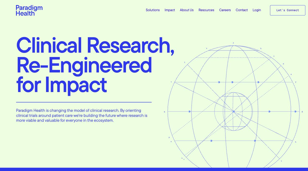
Paradigm Health proves a clinical research brand does not need stock photos of lab coats to feel credible. The homepage is almost entirely typography: an oversized blue headline on a pale green background, one line of supporting copy, and a fine-line globe illustration that reads like a technical drawing. The palette is unusual for the category, which makes it memorable, and the restraint signals confidence. It looks more like a well-funded technology company than a healthcare vendor, which is exactly the point.
2. Denali Health
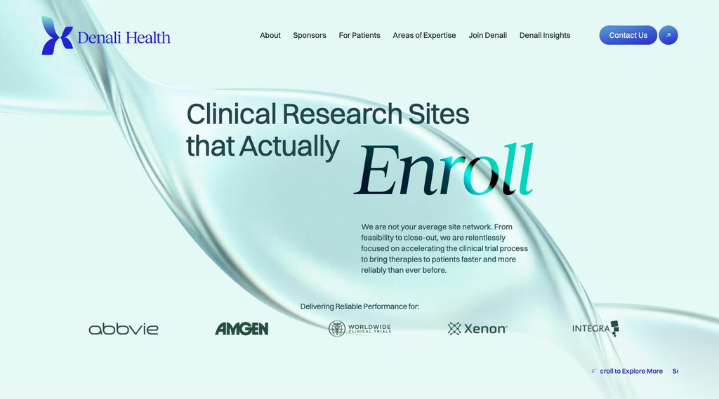
Full disclosure: Denali Health is our own work. Trialsfocus designed the brand identity and built the website. The brief was a site network that speaks to sponsors first without feeling cold, so the hero pairs a calm, glassy visual with a headline that makes one specific promise: research sites that actually enroll. The serif italic on “Enroll” gives the key word weight, the navigation separates Sponsors and For Patients from the first click, and the sponsor logos sit directly under the fold as quiet evidence rather than a sales pitch.
3. Centricity Research
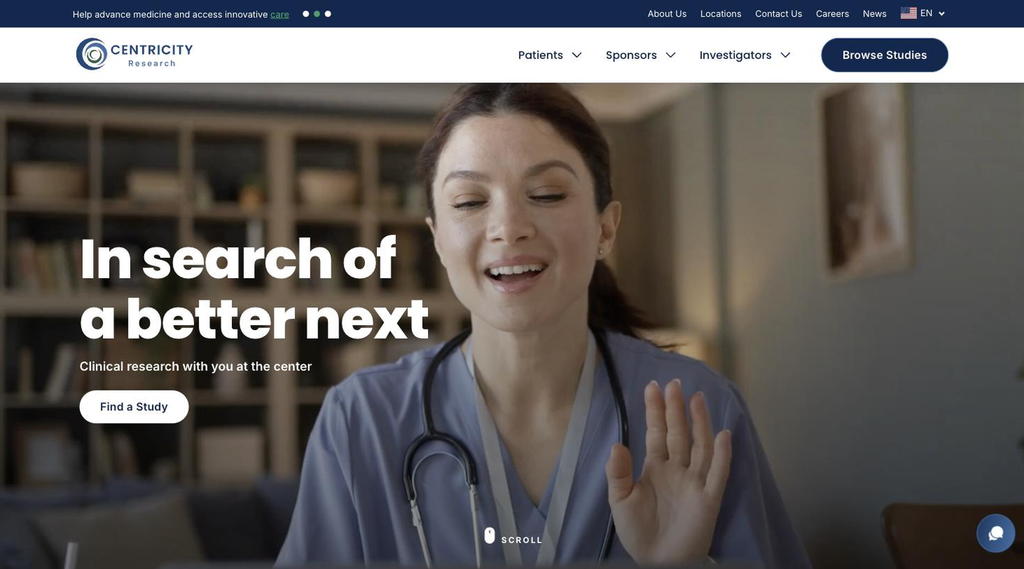
Centricity Research opens with a full-width video of a smiling clinician and a short, confident headline: “In search of a better next.” The effect is human and warm without sliding into cliché. What makes it work is the structure around the emotion. The navigation splits cleanly into Patients, Sponsors and Investigators, a “Browse Studies” button stays in the top corner, and a slim announcement bar points to open studies. Every audience knows where to go within a second.
4. Elligo Health Research

Elligo shows how much polish small details add. The hero image sits inside a rounded container rather than bleeding to the edges, a thin animated line traces across the photo, and the light-weight headline (“One Partner. Every Solution.”) feels calm rather than salesy. The deep plum accent on the Contact button is used sparingly, so the one action that matters stands out. It is a corporate website that still feels considered and modern.
5. Velocity Clinical Research
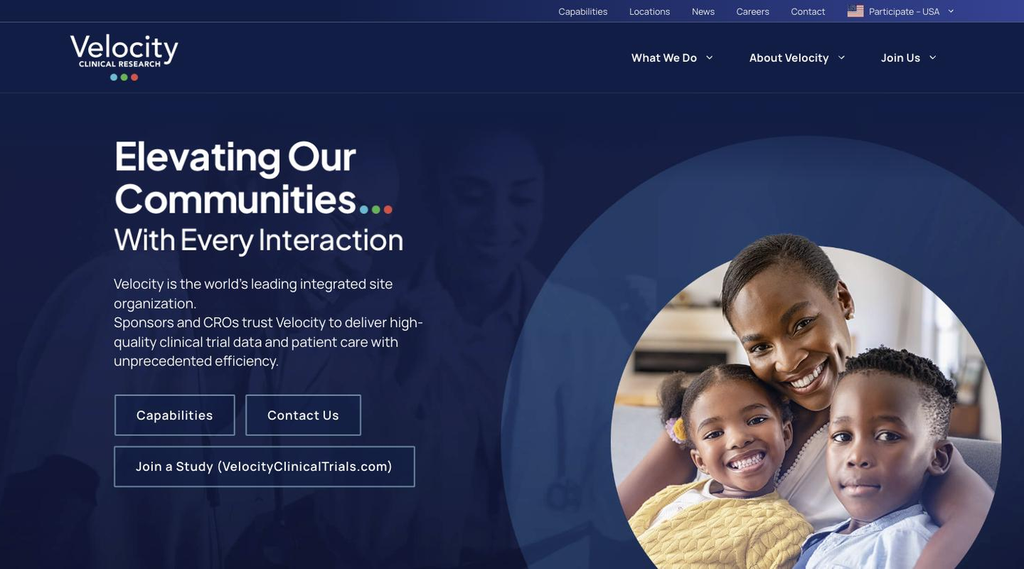
Velocity handles a hard job well: speaking to sponsors, CROs and patients from one homepage. The deep navy background gives it institutional weight, while the circular family portrait adds warmth. The three colored dots from the logo reappear at the end of the headline, a small branding touch that ties everything together. Sponsor buttons (Capabilities, Contact Us) and the patient route (Join a Study) sit side by side, so nobody has to hunt.
6. Accellacare
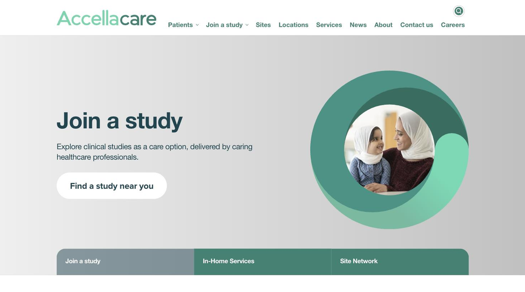
Accellacare, ICON’s clinical research network, is a good example of a website that knows its primary reader. The hero leads with “Join a study” and a single, friendly button: “Find a study near you.” The layered green ring around the photo echoes the logo and turns a simple portrait into a brand asset. Generous white space and large, plain-language type make it feel approachable for patients who may be visiting a research website for the first time.
7. Trial Library
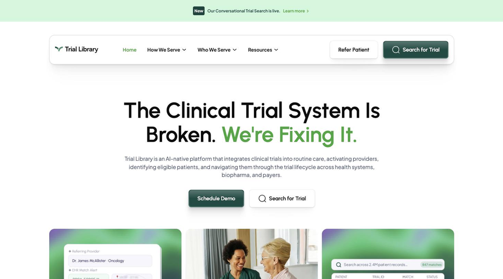
Trial Library borrows the best habits of modern SaaS design and applies them to clinical trials. A floating, rounded navigation bar, a bold centered headline with a green accent phrase, and product cards below the fold that show real interface elements instead of abstract illustrations. Two audiences are served at the top level (Refer Patient and Search for Trial), and the whole page feels light, fast and trustworthy.
8. Flourish Research
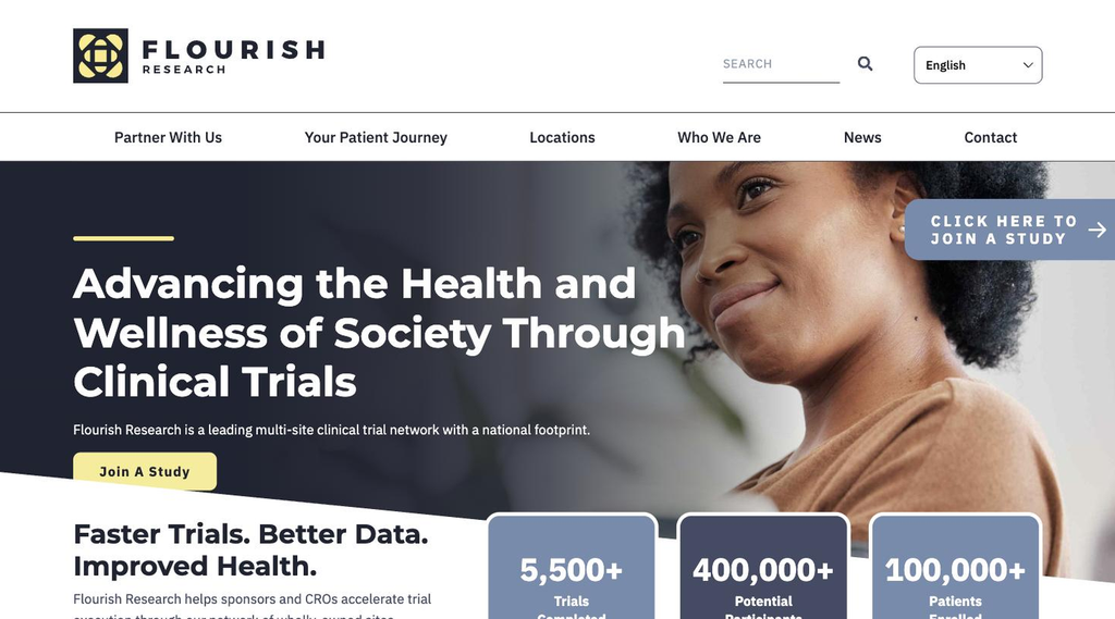
Flourish Research makes its numbers part of the design. Just below the hero, three bold stat cards show trials completed, potential participants and patients enrolled, exactly the evidence a sponsor looks for, presented before they have to scroll. The dark hero with a soft yellow accent is distinctive, the “Your Patient Journey” menu item speaks directly to participants, and a persistent “Join a Study” tab keeps the patient path one click away.
What these websites have in common
None of them try to say everything at once. Each one picks a clear visual idea, makes it easy for patients and sponsors to find their own path, and lets proof (logos, numbers, real people) do the persuading. That is a higher bar than “looks nice,” and it is the one worth aiming for.
If you are curious how your own website measures up, the Trialsfocus Benchmark is a good place to start.