Healthcare is one of the hardest industries to design for. You have to earn trust instantly, explain complex services simply, and move visitors toward action without feeling pushy. The 14 websites below pull this off in very different ways, from playful illustration to editorial minimalism. For each one, we look at the hero and the …

Healthcare is one of the hardest industries to design for. You have to earn trust instantly, explain complex services simply, and move visitors toward action without feeling pushy. The 14 websites below pull this off in very different ways, from playful illustration to editorial minimalism. For each one, we look at the hero and the section right below it, and break down what makes the design work.
Alto Pharmacy
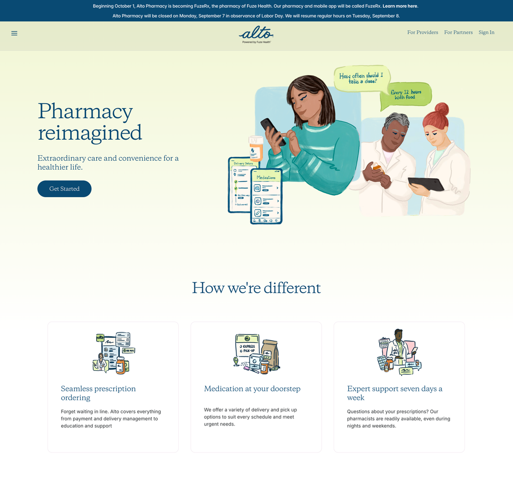
Alto softens a transactional category (pharmacy) with warm, hand-drawn illustration instead of stock photography, which instantly makes the brand feel human and approachable. The hero pairs an elegant serif headline with a single, unmissable CTA, and the illustrated speech bubbles cleverly preview the product experience (asking a pharmacist a question) without a single screenshot. Below, the three-card “How we’re different” section keeps benefit copy short and scannable, with consistent illustration style tying everything together.
Function Health
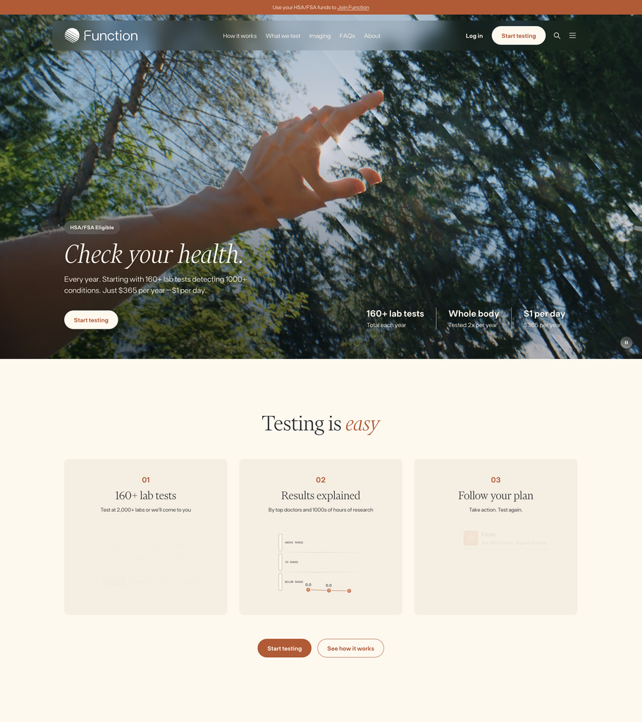
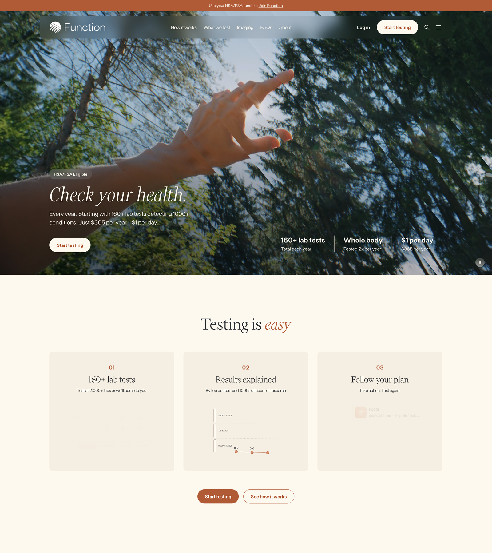
Function leads with a cinematic full-bleed video hero and an italic serif headline that feels more like a lifestyle brand than a lab-testing company, which is exactly the point. The smartest UX detail is the stat bar anchored to the hero: 160+ lab tests, whole body, $1 per day. Pricing objections are answered before you scroll. The “Testing is easy” section reduces the entire service to a numbered three-step flow, and repeating the “Start testing” CTA right after it removes any doubt about what to do next.
Maven Clinic
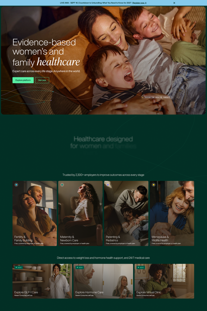
Maven balances emotional photography (real families, warm light) with a clean B2B structure. The hero offers two CTAs that correctly split its two audiences: “Explore platform” for employers and “Get care” for members. The card grid below is a masterclass in information architecture: four life stages, each with its own photo, color-coded dot, and a “Free, covered by employer” label that pre-empts the number-one question about cost. The dark green background makes the imagery glow and gives the page a premium, calm feel.
Ro
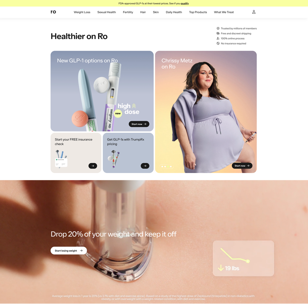
Ro’s homepage works like a well-organized storefront. A bento-style card layout in the hero lets multiple offers coexist without chaos, and trust signals (millions of members, free discreet shipping, no insurance required) sit right where hesitation happens. Category navigation across the top makes an enormous product catalog feel shoppable. The full-bleed section below pairs a bold outcome claim (“Drop 20% of your weight”) with a small data visualization and, importantly, honest fine-print sourcing the claim, which builds credibility in a category full of hype.
Sword Health
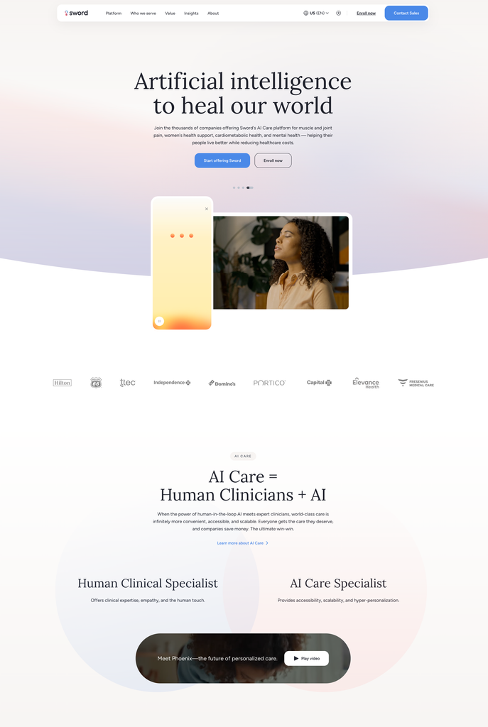
Sword goes big on aspiration with a mission-level headline (“Artificial intelligence to heal our world”) set in an oversized serif against a soft gradient. It reads calm rather than techy. The logo bar of enterprise clients does the trust-building, and the “AI Care = Human Clinicians + AI” section explains a complicated value proposition with a simple visual equation and a two-column comparison. It’s a good example of using layout, not paragraphs, to explain how a product works.
Firefly Health
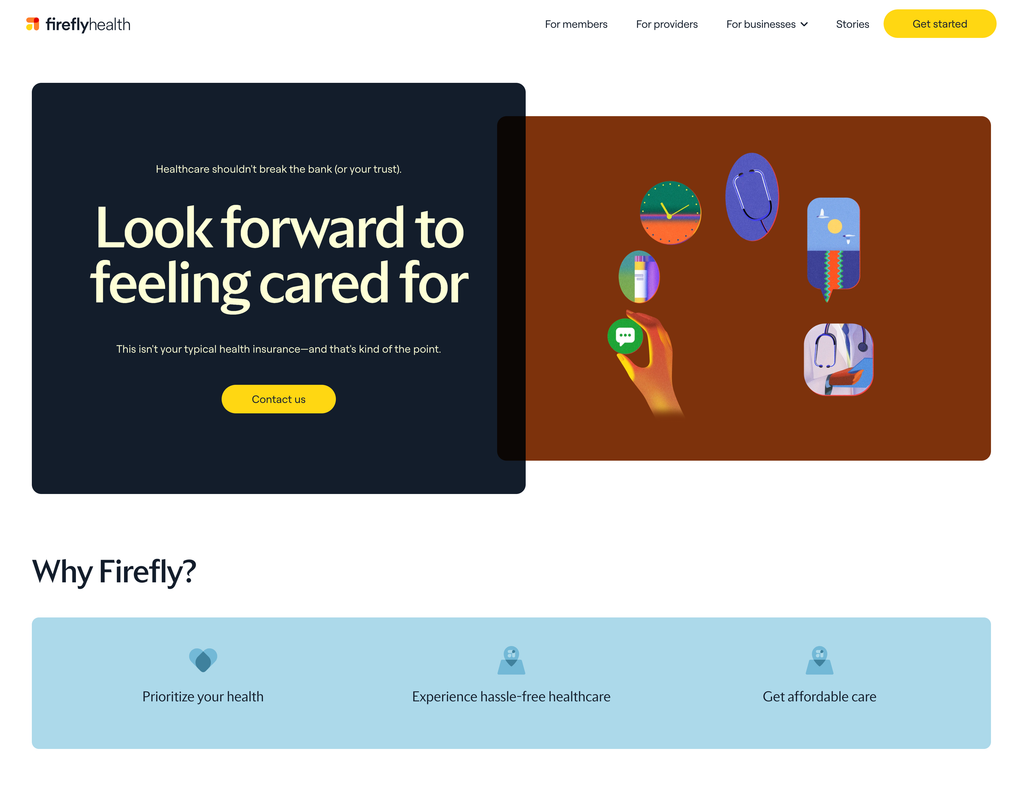
Firefly leans into personality. The overlapping dark-navy and rust color blocks break the predictable hero grid, and the copy has an actual voice (“This isn’t your typical health insurance—and that’s kind of the point”). Floating illustrated icons add playfulness without clutter. The “Why Firefly?” section strips the pitch down to three plainly worded benefits on a single soft-blue band. It’s proof that a health insurance site doesn’t have to look like one.
Cedar
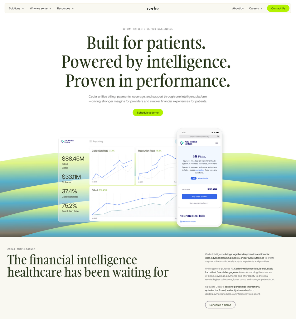
Cedar’s hero is almost entirely typography, and it works. Three short serif statements build a rhythm, a single stat (“50M patients served nationwide”) sits above as an eyebrow, and one green CTA carries the whole section. The product visualization below is beautifully staged: a desktop analytics dashboard overlapped by a mobile patient bill, showing both sides of the platform (provider and patient) in one composition, floating over an organic gradient landscape that keeps the fintech-style content from feeling cold.
Galileo
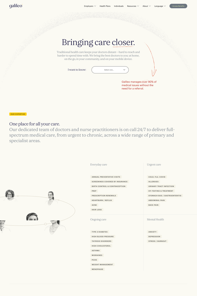
Galileo feels editorial, almost like a well-designed magazine. The hero uses generous whitespace, a serif headline, and hand-drawn red annotations (an arrow, a circled stat) that add warmth and direct the eye to a key proof point. The “I want to know:” dropdown is a genuinely clever UX device: it lets visitors self-select their intent instead of hunting through navigation. Below, care categories are presented as scannable tag pills grouped into four columns, turning a long list of services into something you can absorb in seconds.
Hims
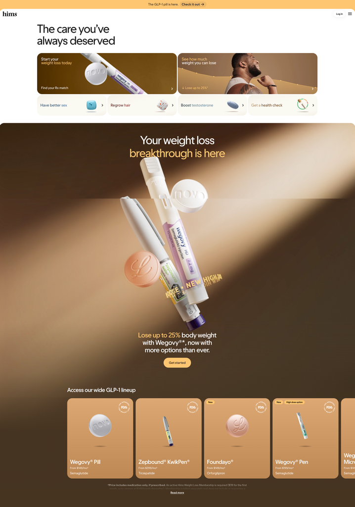
Hims treats healthcare like modern e-commerce. The hero is a compact card grid where every card is a category entry point with its own image and arrow, so users route themselves in one click. The weight-loss section below uses dramatic product photography of medications floating in golden light, elevating pills and injectors into desirable objects. Pricing is shown directly on the product cards (“From $149/mo”), removing friction, and required disclaimers are present without dominating the design.
Amazon One Medical
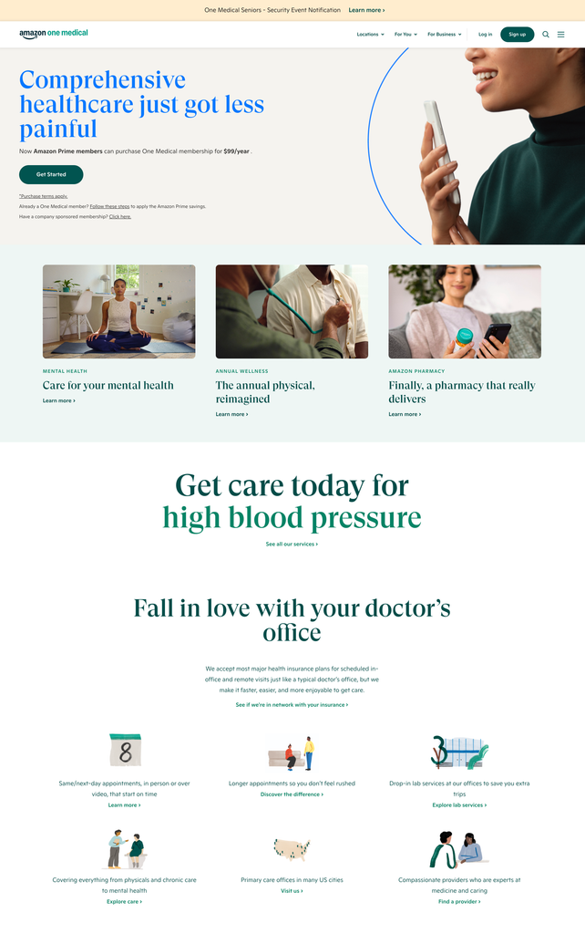
One Medical’s hero is conversion-focused and unambiguous: a benefit headline, the exact price ($99/year for Prime members), one CTA, and small links that handle edge cases like existing members. The section below uses consistent photography and a three-card layout to broaden the story to mental health, annual physicals, and pharmacy. Further down, friendly spot illustrations communicate practical differentiators (same-day appointments, longer visits, drop-in labs) in a light, scannable grid. Everything on the page answers a real user question.
Included Health
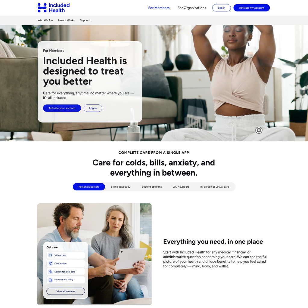
Included Health pairs a bold, confident headline (“designed to treat you better”) with calm lifestyle video and a frosted-glass card that keeps text legible over imagery. The standout UX element is the pill-style tab bar under “Care for colds, bills, anxiety, and everything in between,” which lets users explore five service areas without leaving the page. Floating UI cards over photography show the actual product in context, and the copy consistently connects mind, body, and wallet, a clear, differentiated message.
Kindbody
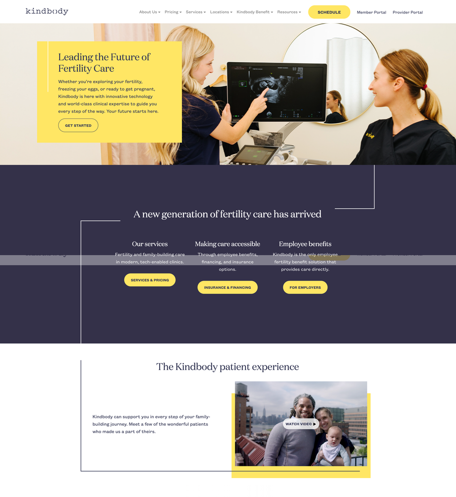
Kindbody uses a distinctive yellow-and-navy palette that makes it instantly recognizable in a category dominated by soft pastels. The hero overlays a yellow content card on real clinical photography, balancing warmth with credibility. Thin connecting line elements running between sections create a sense of a guided journey, which fits the fertility narrative. The three-column section cleanly segments its audiences (patients, insurance, employers), each with its own pill-shaped CTA, so every visitor type finds a path forward immediately.
Headway
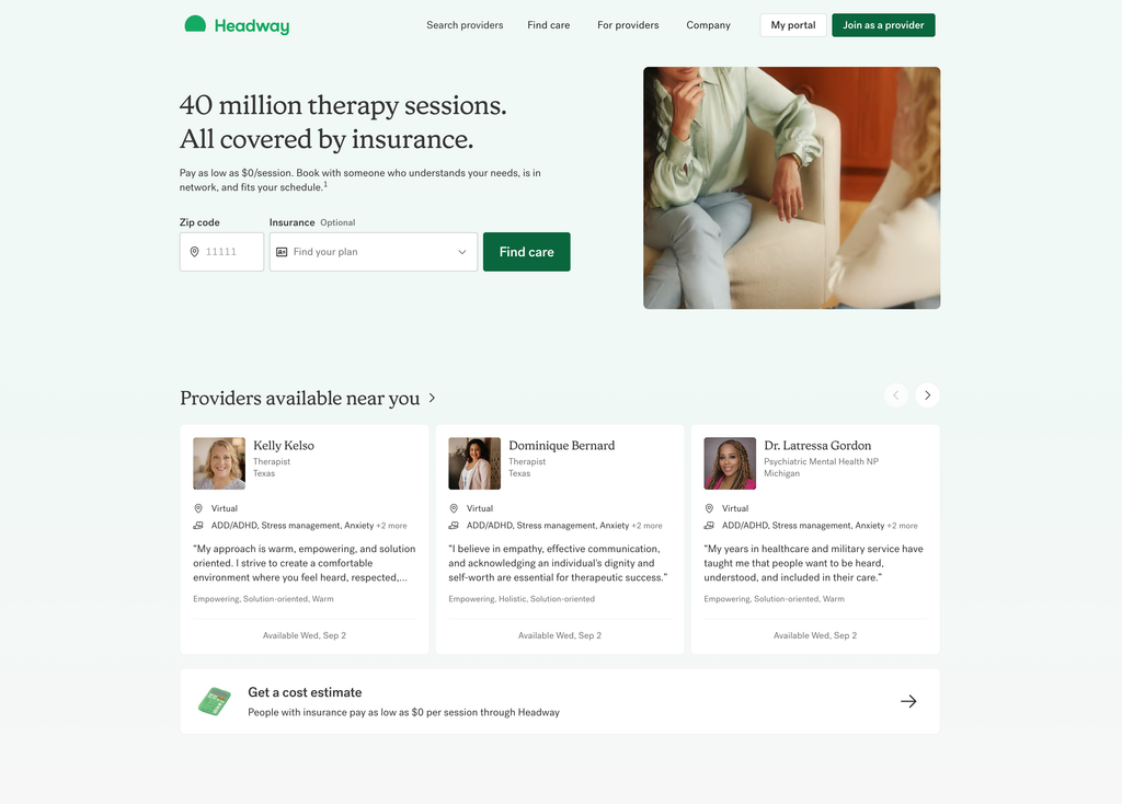
Headway’s hero leads with a jaw-dropping proof point (“40 million therapy sessions. All covered by insurance.”) and then does something rare: it puts the actual search tool (zip code + insurance plan) directly in the hero, collapsing the funnel to a single step. The section below shows real provider cards with photos, specialties, personal quotes, and next availability, giving visitors a taste of the product before signing up. The soft green palette keeps a clinical service feeling human and calm.
Doctronic
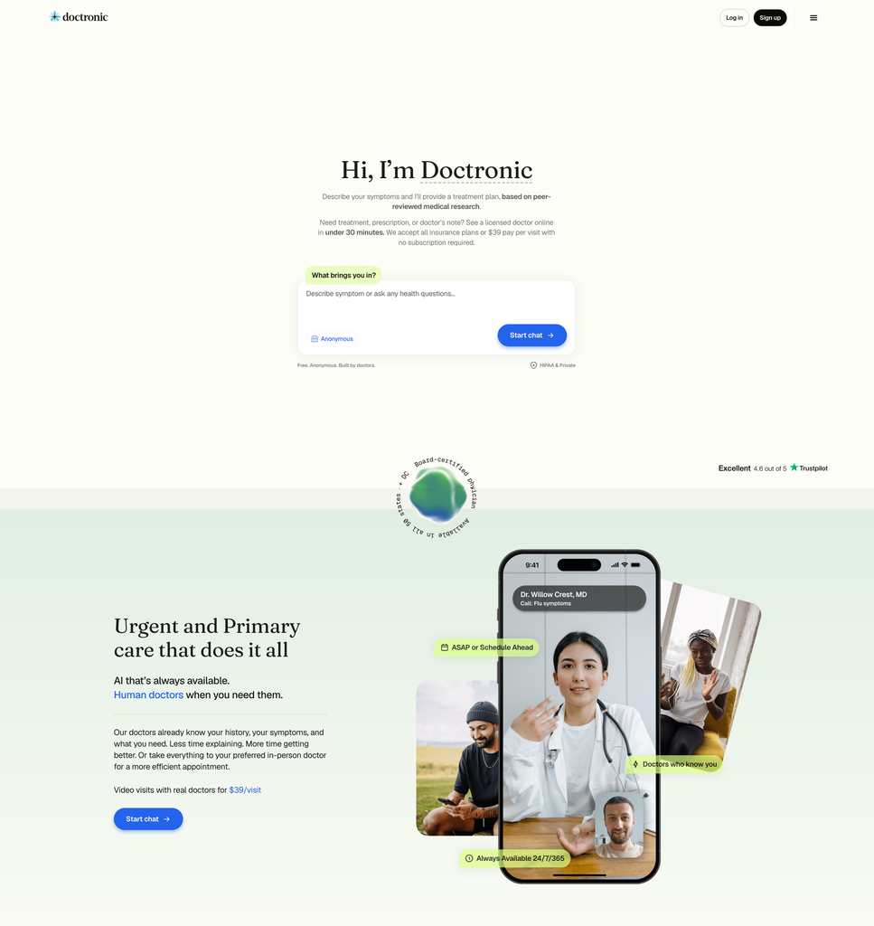
Doctronic makes the product itself the hero: instead of describing an AI doctor, it puts the chat input front and center with the friendly prompt “What brings you in?” so the first click is already the first step of care. Supporting details (free, anonymous, HIPAA, Trustpilot rating) are placed as quiet reassurance around the input. The section below uses layered phone mockups with floating annotation pills (24/7/365, doctors who know you) to demonstrate the human-doctor side, and the $39/visit price is stated plainly. No pricing-page treasure hunt required.
What These Sites Have in Common
A few patterns repeat across all 14: one clear primary CTA per screen, pricing and trust signals surfaced early instead of hidden, real product UI shown in context, and a distinctive visual voice (illustration, serif typography, or bold color) that separates them from generic “medical blue” templates. If you’re designing a health website, those four habits are the place to start.